The Federal Government proposed to store nuclear waste in the Eyre Peninsula near the town of Kimba in SA. Due of the controversy surrounding it, the Conservation Council of South Australia responded with an informative report in order for the govt to rethink the proposal, which included some heavy truths and hard hitting facts about nuclear waste and South Australia's role in the possible storage of it.
The Challenge
The CCSA needed a report that could engage the legislation and encourage an informed decision before it went to vote. While they needed their voice to be heard, the document needed to remain conservative and insightful while remaining informative and impactful.
We needed to design a layout, create infographics, implement a colour palette, and add some typographical flavour to create this 12 page document, including cover.
The constraint: respect a conservative/traditional look and feel, using font and copy provided, while making the information impactful and engaging without losing professionalism. Sometimes it can be hard to not push leading edge design, but to incorporate just enough call it good design.
The Issue at Hand
In order to represent the CCSA report authentically and respectfully, we needed to engage with the information of the issue itself. Not only is nuclear waste a worldwide issue, as South Australians we also have a vested interest. Though our bias was only aligned to our client, understanding their passion and viewpoint was integral to the creation of this document. And understanding that gave us insight into our client's voice as well as the how to reach their audience.
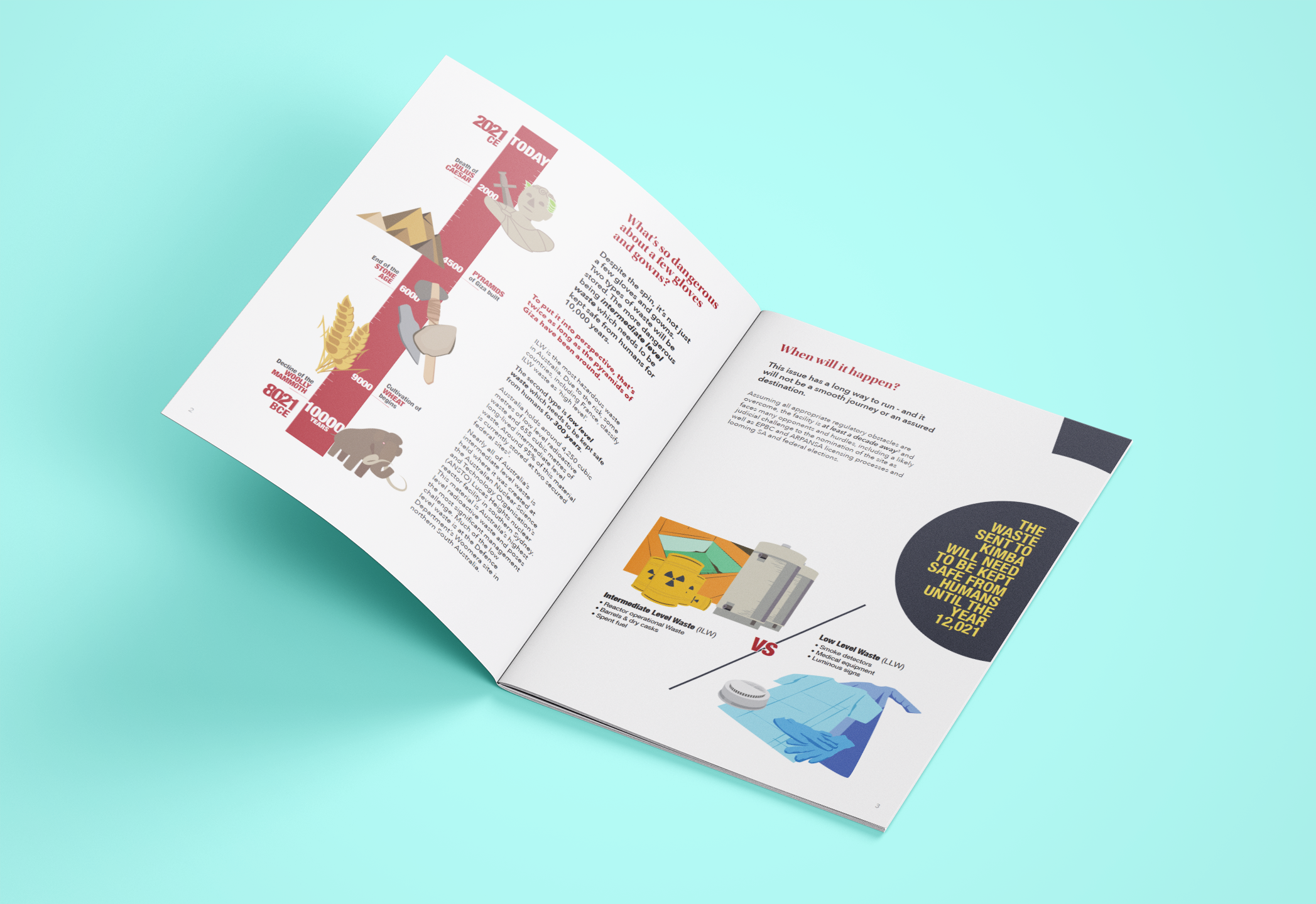
Although the theme is nuclear, we didn't want to drive negative concepts of it down the throats of our audience. Instead we remained just subtle enough to keep clear on the issue, while driving instead an informative, and in some cases a positive, contrast.
The radioactive symbol, used carefully and cleverly, informed much of the graphic solution. The colours were pulled from a version of the standard nuclear yellow with a gentler charcoal instead of pure black, including the CCSA red for the infographics and headers to retain the clear voice of the CCSA. The easy to digest graphics were stylised to be simple, but complex enough to meet the issue without exacerbating it.
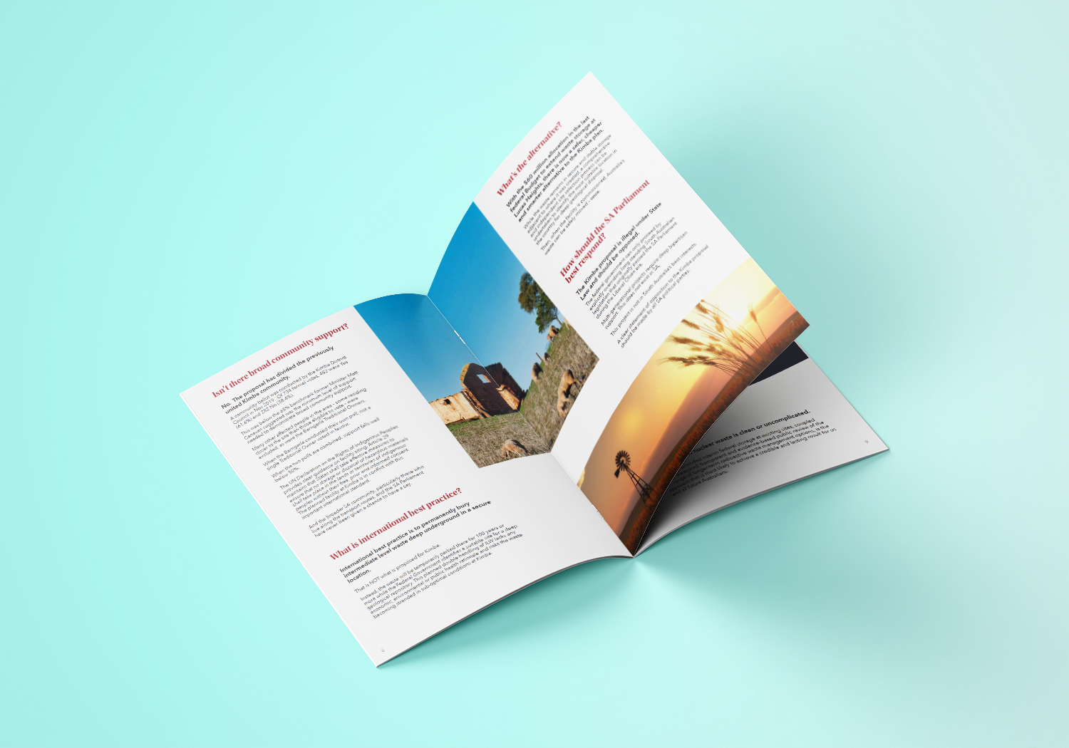
The Result
A clean and beautiful document worthy of any coffee table, but professional enough to please any government official. Most importantly, it's a report that will not only engage the audience, but encourage retained attention throughout, making the material easier to digest and understand clearly the implied messages.